With mobile commerce reaching trillions in global sales and mobile orders projected to represent the majority of online purchases in the coming years, designing for flexibility is no longer optional. Responsive web design ensures usability, accessibility, and visual consistency across devices.
What responsive web design means
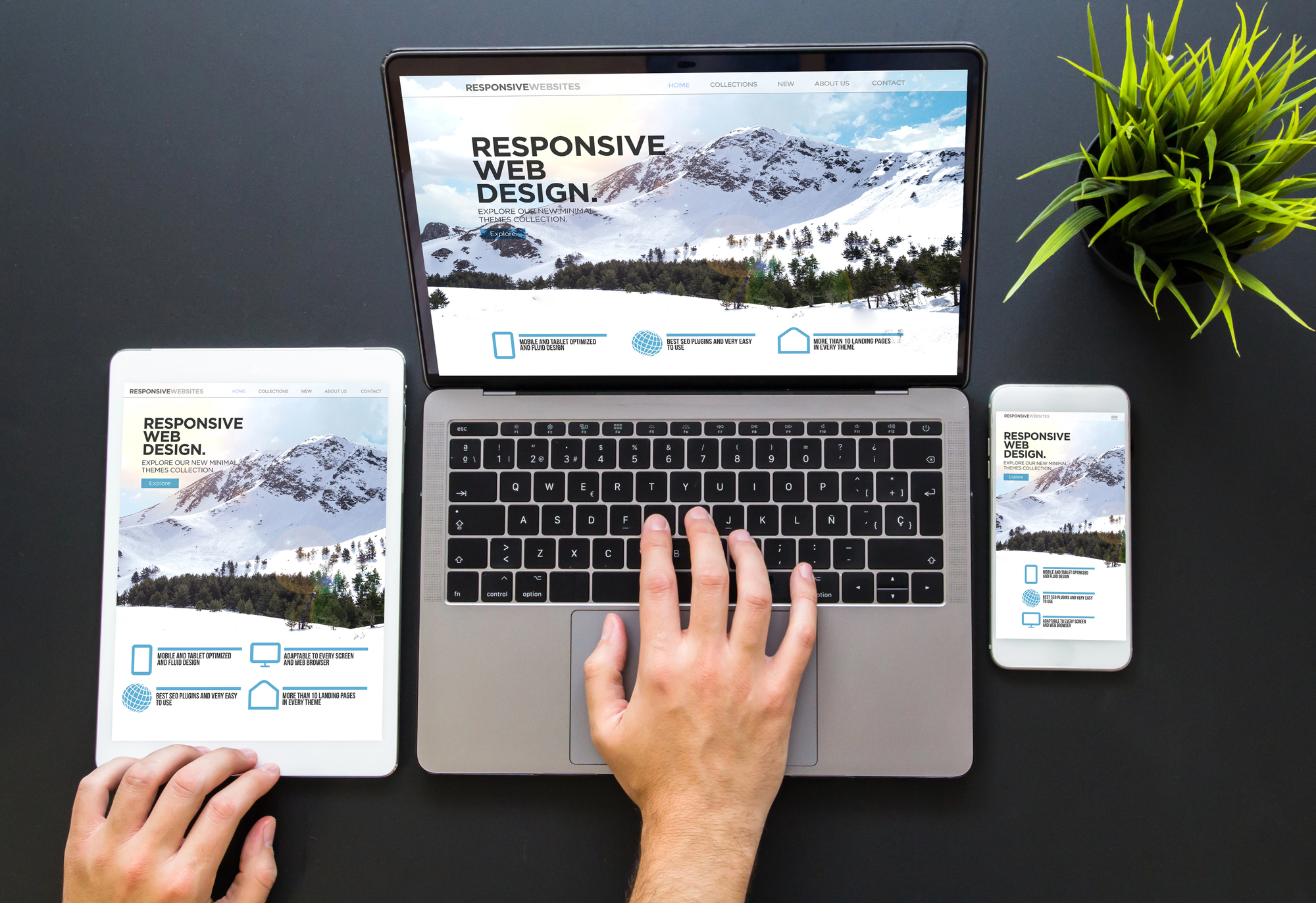
Responsive web design, often abbreviated as RWD, focuses on building websites that respond dynamically to user environments. Instead of creating separate desktop and mobile versions, developers build a single flexible layout that adapts automatically.
This adaptability is achieved through flexible grids, fluid layouts, responsive images, and CSS media queries. Together, these technologies allow content to rearrange, resize, and reflow depending on screen width and resolution.
Responsive design ensures that one website can serve every device without compromising usability or performance.
Why responsive design matters
Responsive design benefits users, developers, and businesses alike. For developers, it eliminates the need to maintain separate versions of a site. For businesses, it improves search engine visibility and enhances customer satisfaction.
Search engines prioritize mobile-friendly websites, especially under mobile-first indexing practices. Sites that load quickly, display correctly on smartphones, and provide smooth navigation tend to perform better in search results.
For users, responsive design means fewer zooming actions, better readability, and a smoother browsing experience across platforms.
Responsive design versus adaptive design
Although responsive and adaptive design share similarities, they operate differently. Responsive design uses flexible layouts that continuously adjust to screen size changes. Adaptive design, on the other hand, loads predefined layouts based on detected device breakpoints.
Responsive solutions are typically better suited for new, scalable websites, while adaptive approaches can be effective when redesigning smaller sites with specific device targets.
How responsive web design works
Responsive design relies on several core technologies and principles. Media queries modify styles depending on screen width or device characteristics. Fluid grids reorganize content columns to fit available space. Flexible images scale proportionally without breaking layout structure.
At the foundation, HTML defines structure and content, while CSS controls styling and presentation. Together, these technologies enable layouts that adapt smoothly across devices.
Software and tools for building responsive websites
Developers with coding expertise often use tools such as Bootstrap or professional development environments. However, no-code and low-code platforms like Wix, Squarespace, WordPress, Webflow, and Weebly offer built-in responsive capabilities for beginners.
These platforms automatically adjust layouts, images, and navigation elements to different screen sizes, allowing users to create responsive sites without writing code.
Additional tools such as graphic design software, wireframing applications, responsive image plugins, and mobile testing utilities help refine and optimize responsive projects.
How to get started with responsive web design
Getting started begins with defining your goals. If you aim to become a responsive web designer, building skills in front-end development, user experience design, and visual layout principles is essential. Online certifications and structured learning paths can provide a strong foundation.
If your goal is to create a responsive website for your business, website builders with integrated responsive functionality offer a practical starting point. Evaluating available platforms and understanding their customization options can help you choose the right solution.
For larger projects, hiring professionals or agencies specializing in responsive design may provide strategic advantages, including performance optimization and user experience research.
Final thoughts
Responsive web design is a fundamental practice in modern web development. As mobile usage continues to grow, ensuring that websites adapt fluidly to every device is critical for engagement, conversions, and long-term success.
By understanding its principles, tools, and implementation strategies, you can create digital experiences that remain consistent, accessible, and user-friendly across all platforms.